I feel I have got that validation of improvement from my own learning and understanding especially from my reassessment project, that I felt I have stepped up a lot now with 3D Max, I still need to make better planning, ideas generation, concepts, give myself targets to progress and my time management. I haven't reached no 'epic skill level' yet not by a long shot but slowly but surely I know I can achieve this.
Before we begin
can some one
I will briefly explain my background ideas and goals.
"One man's trash or another man's treasure?"
(was my project title)
I became aware of the fact that every three years the computers in the game art design labs, get an upgrade and this year new hardware was supplied for us. It got me thinking a bout where the old computers end up. This provided my idea of the trash project, which initially my ideas was not specifically computers but were thought of as electrical equipment, which later evolved into the sort of equipment you might find in office or work areas.
 |
| Primary research #1 |
 |
| Primary research #2 |
 |
| Secondary research #1 |
 |
| Secondary research #2 |
Well since I had an initial idea that I wanted to pursue, I did gather secondary resources first because I can get a better assumption and think realistically if this is possible to create and texture within my budget.
I took photographs such as floor, scene, texture, rubbish, fabric and to combined with my secondary photographs which was an great source of inspiration, ideas and combining/ working out my achievable goal.
Well here are some versions of my development stages of my trash scene, I did model new additions to try out and see if I find them interesting or I deleted and changed them.
I also did rearrange them around to try and get an convincing scene, because it be to bland otherwise not having them give a good pose then just something standard.
 |
My PC tower |
 |
My PC monitor |
Here we have some of my objects that I have developed a lot more from the first stage of blocking out the scene.
< Improvement left to right>
Well my PC tower lacked some geometry and so since I had some extra's tri's I added in some details, which was a good decision and I made the side panel removable.
At first my PC monitor, I was not clear to create a flat screen or a chunky one but I created a flat screen first but when I created my keyboard, I had a thought I could show that the keyboard got smashed through the screen. However I decided to get rid of it, because I realised I wanted 'old equipment' and the keyboard would look better placed in a chunky one. Joe did a chunky screen too :), which was cool, and was useful to see how he modelled it which pursued me to attempt one for my self and my reference was a good guide to.
I did really like the attempt I tried on my first one, but it just looked a bit awkward and realised I don't need to forcefully have the dents, so much and I realized that texturing this would be much demanding. So I scrapped that and made a fresh and better one, a lot simpler which I applied the things I learn't from my first attempt.
I did really like the attempt I tried on my first one, but it just looked a bit awkward and realised I don't need to forcefully have the dents, so much and I realized that texturing this would be much demanding. So I scrapped that and made a fresh and better one, a lot simpler which I applied the things I learn't from my first attempt.
Here are just some of the objects that I decided to get rid of.
One of them were a laptop, something quick and cheap.
I decided not to include, a cup, different type box and a electrical power box, which at first I did want it in my scene there were more favourable ones and this didn't make the 'cut' which I would rather use the texture space for them and to have them more unique and then repeating ones.
I decided not to include, a cup, different type box and a electrical power box, which at first I did want it in my scene there were more favourable ones and this didn't make the 'cut' which I would rather use the texture space for them and to have them more unique and then repeating ones.
After a good while of moving and rearranging my scene, I decided this was a good setup I was after. I was fortunate to have stuff not connected (even though you can unconnect them) but this triggered a thought of, "they don't need to be together but have to spread them around" but this made my scene much believable, as a lot of my objects just looked to static previously, whihc then led me to rotate and lean my objects in different postitions.

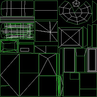
I did my unwrap texture sheet a bout three times and when I was in-mid texturing in Photoshop, there was times that I went back to my UV and adjusted some around.


It can get a bit frustrating when sorting out the textures because I was undeceive on what I was going to texture for it and unique texture or ones layered on top.
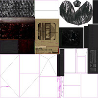
My texture sheet in Photoshop, when it was started and then to a better development stage. I do a series of cropping, painting, manipulation,image adjustments and much more that is required constantly to get the correct texture on all levels.
Here is my final result of my texture map in Photoshop of my trash project. As you can see I tried to show, wet cardboard by painting and using burnt and dodge tool. Then using some texture and brushes for dirt splashes on the chair, added details overall to the other objects and tweaked, improve the contrast on some textures, then went for some graffiti on certain objects with some symbolism, like the slenderman sign, peace sign, pacman and political statement, to just then fit a scene with the theme of a graffiti area.


No comments:
Post a Comment