Saturday, 1 December 2012

Destination Loughborough Trainstation : Week 2

The Game Art teletubbies crew, (we may as well be called that) beause were all a bout fun and games and ready to work our a$$es off for mondays visual design lesson the paradox of that, we are still half and the only fun and games, is to stay in bed haha ^____^

Nah I kid, we all "playfully" adventured to the land of Loughborough Trainstation for the second week of drawing out in the open virtual air.


First off the weather was dry and a slight drizzle at times, we was prepared but there wasn't no Mr.Sun :( so not much to capture the lights and shadows in our drawing, We keep missing those days lol.


Here are just some images I taken on the day of the place, thought it be nice for the viewers to see what type of place it is. It was a very interesting place, it is a museum kind of place, where it has the old traditional platforms and rooms, with some items a bout and of course stationary trains.
We were able to go walk this path and cross some tracks that led to the garage of 'men at work' I am suprise they were okay having students not only from our university and there was some from a college near Loughborough, near the area or inside the massive garage.

 that 'the health and safety' personal would have a fit hah :D
There was some massive trains inside and other interesting objects a bout, the people didn't speak to us but more so looked like we didn't existed ha, but atleast we were able to go inside and around the place without no trouble, it was very intriguing, looking at different kind of shapes, objects and the details on them


Here is my first page of thumb-nails, it was a bit tricky to understand the perspective on things and mark-making on some objects to give outsome destint forms. Felt my drawings lacked the imporants of information, detail and the variation of value. 

However, it was a good practise step to understand and problem solve in my drawing, I did have a quick attempt in some water colours but not really committed well but what I got from is that I section out certain objects which was good, just need to be more careful but expressive ;)


 This was just practising on different ways and approach that can give much more drammic difference. Same object but ones at 1pp and the other at 3pp.

(the first one poorely drawn sorry lol)


I took in what I learn't from my previous page of thumb-nails and I thought to give much more time and care but still consider pace. However I used some of my markers to give in some value and hue mixed with my pencil markings. I quite like the effect and it was a lot faster to place down and it gives good results.
I really like this page of thumb drawings, because to me it has some diversity to it, with different mark-making, perspective and variation of objects.


My Digital Thumbnails


 Here are some digital thumbnails, a bout 15 minutes on each one. It was useful to understand the surfaces, materials, textures, to try to capture and paint this in speedy amount of time and also maintaining as much correctness and accuracy I can. I notice I was learning different painting styles and process which was useful.


 My Lough Borough, this took a bout 4-6 hours to paint. I wanted to do something a bit different for my Lough Borough final, it was also interesting to understand lights, dark and tonal value, reflectiveness and atmosphere. I wanted to try and capture the whole thing as best as I can and took a while to get things in the right perspective and angle, I believe things maybe a bit off still but happy with the result.


Pretty proud with this result, much better final from my Abby Park. I had a good critique from my peers and it was a bout the background the trees is in the wrong angle and there should be a bit more interest and the guy looks a bit sketchy and fluffy. I will commit these changes as soon as I got time to correct but for now, move onto the next!


Thursday, 25 October 2012

3D - Le' Trash La' Projúct part 2


 I decided to go with  this texture for my floor, because I wanted a different type of flooring then the pavements that I presume it give a bit of uniqueness and style which complemented with my wall.

Well I tried to remember how to tile with the offset, that if you half it once or half it twice maybe? I did have a try but didn't work well. I searched on-line and found a tutorial on how to tile, which was a bout using the offset but instead of doing the clone tool or patch tool or copy one side over, all you do at the start is select the area and press Fill > Content-Aware' tool and it really gives a brilliant result, then I did carry on using the other techniques to give it that better blend.


Well I remember from my collection of photographs, I keep for resource that I had a photograph of a scene of really awesome graffiti artist work. This is my brother in one of the picture to show my own reference.


 This is my texture, that I added a brick wall texture, which I didn't need to tile, because I transformed and stretch it across was only necessary and then I contrasted my reference and multiplied on top. Why I chosen this image, is because the art and graffiti is pretty original and goes with theme of my scene and has messages within the art itself.

Final Renders


3D - Le' Trash La' Projúct part 1

The Blitz Games Studios, Trash Box Project, must say it was a very good induction project to start of with for the second year.

I feel I have got that validation of improvement from my own learning and understanding especially from my reassessment project, that I felt I have stepped up a lot now with 3D Max, I still need to make better planning, ideas generation, concepts, give myself targets to progress and my time management. I haven't reached no 'epic skill level' yet not by a long shot but slowly but surely I know I can achieve this.

Before we begin

 can some one


I will briefly explain my background ideas and goals.

"One man's trash or another man's treasure?"
(was my project title)

I became aware of the fact that every three years the computers in the game art design labs, get an upgrade and this year new hardware was supplied for us. It got me thinking a bout where the old computers end up. This provided my idea of the trash project, which initially my ideas was not specifically computers but were thought of as electrical equipment, which later evolved into the sort of equipment you might find in office or work areas.

Primary research #1
Primary research #2


Secondary research #1
Secondary research #2

Well since I had an initial idea that I wanted to pursue, I did gather secondary resources first because I can get a better assumption and think realistically if this is possible to create and texture within my budget.
 I took photographs such as floor, scene, texture, rubbish, fabric and to combined with my secondary photographs which was an great source of inspiration, ideas and combining/ working out my achievable goal.


Well here are some versions of my development stages of my trash scene, I did model new additions to try out and see if I find them interesting or I deleted and changed them.

I also did rearrange them around to try and get an convincing scene, because it be to bland otherwise not having them give a good pose then just something standard.


My PC tower


My PC monitor


 Here we have some of my objects that I have developed a lot more from the first stage of blocking out the scene.

< Improvement left to right>

My Filing Cabinet

Well my PC tower lacked some geometry and so since I had some extra's tri's I added in some details, which was a good decision and I made the side panel removable.

At first my PC monitor, I was not clear to create a flat screen or a chunky one but I created a flat screen first but when I created my keyboard, I had a thought I could show that the keyboard got smashed through the screen. However I decided to get rid of it, because I realised I wanted 'old equipment' and the keyboard would look better placed in a chunky one. Joe did a chunky screen too :), which was cool, and was useful to see how he modelled it which pursued me to attempt one for my self and my reference was a good guide to.

I did really like the attempt I tried on my first one, but it just looked a bit awkward and realised I don't need to forcefully have the dents, so much and I realized that texturing this would be much demanding. So I scrapped that and made a fresh and better one, a lot simpler  which I applied the things I learn't from my first attempt. 
Here are just some of the objects that I decided to get rid of.

One of them were a laptop, something quick and cheap.

 I decided not to include, a cup, different type box and a electrical power box, which at first I did want it in my scene there were more favourable ones and this didn't make the 'cut' which I would rather use the texture space for them and to have them more unique and then repeating ones.


After a good while of moving and rearranging my scene, I decided this was a good setup I was after. I was fortunate to have stuff not connected (even though you can unconnect them) but this triggered a thought of, "they don't need to be together but have to spread them around" but this made my scene much believable, as a lot of my objects just looked to static previously, whihc then led me to rotate and lean my objects in different postitions.

 
I did my unwrap texture sheet a bout three times and when I was in-mid texturing in Photoshop, there was times that I went back to my UV and adjusted some around.


It can get a bit frustrating when sorting out the textures because I was undeceive on what I was going to texture for it and unique texture or ones layered on top.


 My texture sheet in Photoshop, when it was started and then to a better development stage. I do a series of cropping, painting, manipulation,image adjustments and much more that is required constantly to get the correct texture on all levels.


Here is my final result of my texture map in Photoshop of my trash project. As you can see I tried to show, wet cardboard by painting and using burnt and dodge tool. Then using some texture and brushes for dirt splashes on the chair, added details overall to the other objects and tweaked, improve the contrast on some textures, then went for some graffiti on certain objects with some symbolism, like the slenderman sign, peace sign, pacman and political statement, to just then fit a scene with the theme of a graffiti area.


Here is a quick render of my scene with the textures on, I am really quite pleased with the result, I believe the graffiti is just something simple but not over the top, give it that kind of amateur level.


Wednesday, 17 October 2012

Mitch Small - Workshop

Today we had a concept artist Mitch Small a previous graduate of the Game Art course and his friend who is a concept artist as well (sorry didn't catch your name). .

Mitch did some demonstrations of one typical pipeline process he does to pitch his concepts ideas and he gave out beneficial information about the industry, programs, guidance and techniques.

So Mitch first presented a quick concept piece he brushed up in Photoshop, which was an eastern type of market, that had it's eastern architectural , furniture, people, animals etc.

From this it led him to convey this into a better understanding of his idea, that he has certain methods he goes through that can achieve this and he is using that quick painted concept to visualise and create this in 3D max then further on in Photoshop, with textures and painting.

 I would like to reflect and recap what I learned today, to show what I remember, know and have done.


Firstly he does a quick and simple geometry scene, using the standard primitives in Max


He did ask for people if they want to follow, but you have to be like Flash Gordon to catch up with his speed of the demonstration. 


So at this point basically, we set-up a camera, this was to get the angle, perspective and frame that scene, so only what the camera visioned is what was saw and rendered at the final result.

Then he went about putting in the building/shapes to give some representation in simple form.

It was good to see the way he went about creating his scene, it was just fast, simple and organised.

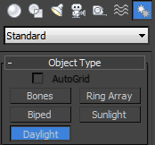
Then, after he needed to establish some light and shade conditions, so he put in something really awesome, that he demostrated before, but can not recall how he did it.

DayLight, lighting
Which is pretty great because you can set the time of month, day and year as well  as the time of day, where the sun would be visible in the 'sky'.

So as you can see in the picture below on a progress that I got up to, before it got really fast and difficult to follow, so he got onto a Modifier FFD (I think lol) which was pretty awesome because it allowed to flex geometry shapes, which seemed more efficient than how I would go about it.

So I and a few others weren't able to do this part and so my  scene lacked few details however, I still was pleased in what I have achieved for now.


Then finally it was time to 'render' the scene but first we needed to change to Mental-Ray in the render options and then we went onto our Material editor, searched for -mental ray in the material/map browser and then I picked the Autodesk Ceramic

After this it was time to take a render of the scene


Ah, it was awesome how this turns out, really good idea to use for my own renders in 3D Max. He also said it is important to know how to make good renders, so it will be better for your presentation of work and portfolio.

So now, saved this and put it into Photoshop where Mitch was on his second phase of the way he goes about things.

Well trying to remember this part, is where he saved his render in different versions like an alpha, colour and normal. So when it was put into Photoshop he was able to make separate selections and group parts accordingly with layer mask.


Firstly then we painted in some ground on the floor, using a normal round brush and just making marks for flooring, sizing up and down of the brush and colour picking tones that were applied to mix and blend to get a ground.


While Mitch has all his textured planned and sorted, I quickly search a couple and tried to catch up and carried on following At the moment, just some wall, dirt, floor texture.


Then I got some quick window textures, I couldn't find anything in good time, remotely similar to what textures Mitch was using and then, I just decided to leave it as it is and carried on watching instead.

To be fair, I kind of understood and know which methods to apply the textures on the 'buildings' with the techniques like clone stamp, patch tool, the layer properties, eraser, then transforming in other angles. Pretty much the set of techniques we learn on texturing in 3D max. Then Mitch, had pre-made brushes of other references of people, animals etc and he did a bit of painting on top.

Then the demonstration was finished. He just explained his methods and by  doing, he was broadening his concept so that other artists or directors could understand the concept direction.

Overall awesome demonstration, learnt a lot and recapped last years workshop, which were slightly similar and as well giving advice and speaking openly was great sincerity, other questions and answers spoken and the feedback was informative.


At the time, when he was waiting for the render in 3D Max, he was giving us some art fundamentals advice and I thought to do a little sketch in the process :)


Thought I would explore the view of my scene and render it, looks pretty awesome in this view.