Monday 7 May 2012

20 - Christmas break (Vehicle design project)

I made a miserable attempt with my Vehicle project at Christmas, so it was good that it was needed to be finish.


Here are my thumbnails that I did using felt pens, just random scribbles and ideas out of my imagination.


A quick concept and learning different approaches from the silhouette


Here are line sketches of different concepts moving lift, flying vehicle I was thinking. I'd then paint over in a Sci-fi look. I do feel I could added some textures to them but might be a bit much. 


Here is a quick blueprint design in pencil. Trying to understand perspective and design


Here is a  paintover from the blueprint design I quite like the look of it at the moment. I might improve the final with texture brushes and colour.


Here some better render of the Jet concept. I wanted to see different variation in colour and texture and I was trying to improve in my design presentation as well.


19- Bradgate Park Study

Just like the Museum, we revisited  Bradgate Park, glad got a chance to get extra practise because felt my attempt on the Bradgate Park back in the first semester wasn't so good and my efforts and my skill has improved a lot more and I enjoy landscapes and need to get better at them.


Here are eight thumbnails that I done for myself to then choose and select which one I like to further on into a final.

I have improve on my perspective and the composition, though I think I need a bit more variation in contrast.


I have chosen the first thumbnail in which this was the same composition from the last semester. I felt I wanted more justice and see how much improvement I have and what I still need to improve on.

I feel my perspective has improved a lot more, but still lack in painting in organic objects and the environment.


I dislike the colour version, so I thought to to try to make it into grey scale to understand the value a lot more and can understand the form a lot better.  Had some critique by Tony, Victoria and Michal on the course that suggested, cropping of the image, lowering the road and putting in a fence in the foreground.


Bradgate Final Painting

I feel this was a good practise to understand light, dark and composition. Also painting organic objects such as trees, I need a lot more practise.

18- One hour New walk Museum study

We went back to the Museum to do an one hour practise and development
I wish I was prepared more with a better sketch book but I did few studies and still happy with my progress.


17- Masters Study

The Master Project was an good fun project. It made me realise and remember that there loads of really unique and fascinating styles that really inspirational. I couldn't settle on an Artist straight away, so I visited the library to broaden my scope on new artist and styles.

I loaned a few artist books, Ragazza Con Tamburello and Mona. I really like the artist and love the styles but I just struggled trying to study the work.

So I went back to a few artist I know and did a few studies from each one of them;

- Masters Portraits Studies, charcoal studies

- Leonardo_Di_Vinci, digital painting attempt

- Dante_Rosseti, final digital painting

- Impressionist final traditional


 This is one of Mona's works that I tried to attempt with some acrylic paints. This was a small study to see if I can understand his style and have a go in replicating it. However I made a little mistake in having the blue as a wash, which caused rest of the paints to have different colour.

I feel I need to do a lot more in traditional medium, specially painting because this would not only contribute to my digital painting, but the energy and the commitment with traditional painting can sometimes feel much more rewarding when using it.

I am still happy with this attempt, learn't what I can't do for which to improve on.


Jacopo Da Pontormo 
Head of a Women

Master Project Warm Up in Charcoa
I feel I got the angle of the head wrong, should be titled
more straight and as well my shading isn't quite good. Happy with the warm up to see how well I do.


Michelangelo Buonarroti
Head in Profile

Master Project Warm Up in Charcoal
Still their is some good likeness in here, but I need to watch myself not making lines up and follow the reference a bit more accurately.


Andrea Del Sarto
Head of an Apostle

Master Project Warm Up in Charcoal

Certain parts in which gives a good likeness but still few differences however really like the mark-making in this and probably my strongest attempt :)


Leonardo Da Vinci

This was an quite hard piece. I kinder gave up because of some proportional erros and I felt I like to come back to this and finish it another time.  Still happy to how I got to at this stage.


I could of took earlier shots to show process but here some minor ones when I was doing my Masters in Pastel. 


Here is my final in pastels. I really enjoyed doing this, was a good personal process in observation and understanding, because quite challenging in traditional medium to get things right. I believe from this exercise, I notice that I was picking up and understanding "Light and Dark" and different tones mixing together to give some depth and variation.


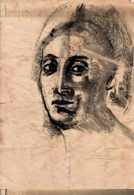
Here is my Master Study
 Dante Rossetti Beata Beatrix


Here is the process of my development stage 

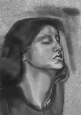
Here is a larger scale, before I went to add colour
I thought it was useful way to start off in 
grey scale to understand the tone and value.


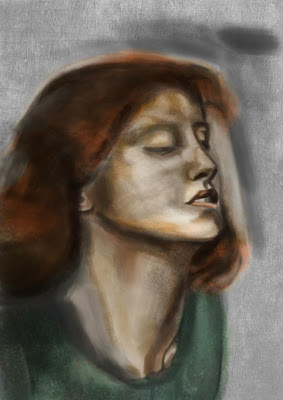
Here a quick over-lay colour, with a default dry-medium brush which gives a sense of noise/ scatter pixel.
Which I thought it be useful to use this type of brush
Because hopefully I can simulate painting on canvas

Just notice the reference I used was to dark even
though it 1080p quality, other images seemed a lot
better to use to paint.


My Final Painting

I've only capture so much of it, though I feel I learn't enough from this piece
There a lot of improvements still but I tried to capture the painting brush strokes and the canvas texture.


Thursday 3 May 2012

15/16 Interesting 70's Character Project

The 70's Interesting Character Project, was a pretty an good project because it allowed you to do a bit of history searching in the 70's and then create something from that into a character.

So I had an interest from 70s band called K I S S. Which I really admire the make-up and costume and also a Band now which is called Black Veil Bride, which was influence by Kiss. I thought their added style combined with Kiss, could make something original.


Here is an quick concept of my 70 character. I felt that the features and style of BVB guy, felt more appealing towards what I was aiming for a Gothic Heavy Metal  Singer. I quite like the costume design and the make up that I done. However if I had more time, a lot more variation. I think the middle one, his body looks too small and his head doesn't look right on that, though I really like all the costumes. 


My Final Painting

 This is the grey scale version I worked on. I really felt merging and combining a lot of elements from my draft concepts from the belt buckles, leather jacket and the white design part. I felt I didn't want to over complicate the face with pierces or tattoos and I put spot lights in the back that gives the thought of a 'metal band singer'. Hopefully got the proportions correct.


This is a colour version, of my 70's character. I used the overlay and blended the colours with soft brush and other brushes. I had some critiques that the light should be a lot brighter that the lights behind him that would give him a stronger silhouette of light a there is three big spotlights shining on his back, which my character almost looks ghostly in a way that the light shining through him. Which I totally agree to be fair, this was last minute so I did struggle in doing this correct.

14 - Self Portrait


Here are some quick self-portraits I did in the mirror. It was pretty awkward drawing from the mirror but yeah, it’s amazing how difficult it really is drawing you, but it gets really peaceful and gets a nice sense of connection to yourself. Appreciating your uniqueness of features and characteristic which I felt I had a lot more after this exercise. I saw myself different, I saw that I am a good subject and first hand reference to study and on each attempt I had made that extra tweak of improvement.

So I take one of my sketches and put it into Photoshop, as you can see from my process, I just painted the light and shadows, then I manipulated this with using some really good space references and used custom brushes. I quite like the funky outcome.
This was just a quick simply play around in Photoshop. Just understanding and experimenting with different ways of painting/ concepting. 
This is a portrait practise I did of my girlfriend. I really like how this turned out, I didn’t quite finish it, though to the stage I was at, quite impress in my painting skills in blending the skin and having good contrast of hues, that gives a good sense of roundness and likeness of my girlfriend and even the simple background elements thought it worked well with this painting.

In Life drawing we was using charcoal medium and I really enjoy using that. So I thought to use some charcoal in practise for my portraits. I did a speed sketch of my brother, trying to be expressive with the medium, using it sides to cover areas of tone and then darkening the areas of interest. I still have problems in getting the features to look much more convincing the lips I have difficulty with, but there is decent proportions and likeness, which I am pleased with.


I’d then do one of my self. I felt a massive improvement and amaze on the time I did this in. I also love the texture of which the charcoal presents and felt a much stronger contrast in this charcoal drawing. I felt I was able to express myself really comfortable when doing this and that Improved on the features which when using charcoal you have to be accurate and bang on correct first time, because it really isn’t erasable.

I thought to put this in Photoshop and apply some colour to it. Just nice and subtly, nothing to heavy and looks a nice graphical style.


I was enjoying speed drawing a lot and so I thought to try one digitally and sticking to one brush and settings, I created this within an hour and 45minutes I felt it right and enough to stop at that time, because I really like how it looked in a sketchy state and not trying to spend hours in fixing/ detailing it, which could end up ruining it.


13- Interesting Character Project

12 - Guild Hall


We visited Guild Hall in Leicester; it was a pretty amazing place, for its old architectural design and had a lot of character. We all wished it wasn't freezing there, whist we were drawing; however it was inspiring to see a lot of old furniture and ornaments.

We had to do thumbnail sketches and then do a final piece.

Here are some thumb nails of the place. I felt I have improved a lot from semester 1 and felt a lot more confident drawing from life, I felt I should of done a bit more extra traditional thumbs and maybe use different medium.
These were some extra thumbnail practise doing digitally. It felt a lot easier to get tonal value down, however I notice that, I lacked in contrast and my perspective wasn't always right.
Just showing my process on how I was conducting the thumbnails. I really thought this might be my final design because I felt I captured the room well. Though just couldn’t imagine anything creative from this.

Here is my Final Painting

I thought to create a snowy, cold, damp concept, which looks very water colours. I do like many things of this painting, like the warm colours of the walls and myself trying to paint in light and shadow that I feel this had a nice overall composition to it. 


11 - Ninth Floor Dreams

These are one of my many references for the 9th floor project which I was gathering a lot of material and ideas for the new move next year for our course. It is obviously all hypothetical for which the lectures wanted us to understand and for us to practise concepting interior design.
 These are a few blue print designs of the 9th floor. Which we had complete freedom in knocking out walls if we wish or the layout of the classrooms, doing these blueprints was good to learning curve, but felt to limited and controlled which got annoying.
We had freedom to express our ideas by doing it 2D or 3D. I thought to show my ideas using 3D max from fur thing on from the Blue Prints I done. I wish I had more time making each objects a lot more convincing, however I thought this is only design purpose and pitching my idea with simple shapes for which the client can visualise the detail object there. 
Well I thought it be nice if our course had a library for which we could sit and read and look at many sources of material and as well have an eating canteen area for when we have our lunch or make a drink because there isn’t really anything at the moment.
This is my 3D overview of the 9th Floor Project, it is quite appealing seeing it in 3D and I am quite happy that I chose to concept my ideas in this method. I felt I should of done a lot more in doing some painting.